In my mid-twenties — after a second attempt at finishing an English degree and being absolutely miserable — I finally decided to stop letting other people dictate my life. I went back to school for what I had always wanted to do: graphic design.
Now, keep in mind: while I loved being creative growing up — art camp, photography courses, anything that involved making something out of nothing — I wasn’t exactly encouraged to pursue it. My family wanted a doctor, and come hell or high water, they were going to get one. That meant science, math, and just enough art to meet the legal minimum.
Don’t get me wrong, I’ve always been of two minds. I love art and creativity, but I also love math and science. I was basically a mathlete before mathletes were a brand. Spreadsheets? Sexy. But becoming a doctor? Absolutely not. I couldn’t shake the feeling that I was meant to do something creative. For years, I told people I wanted to work in “the creative side of advertising” — which was really just code for “I have no idea what a graphic designer is, but I think that’s it.”
So when university applications rolled around, I staged a quiet rebellion and applied to business school for marketing. It felt like a compromise: still university, still respectable, but at least vaguely adjacent to creativity. That lasted exactly one agonizing semester. I transferred into English — because it was the only class I actually liked — without telling my family.
Plot twist: I hated that too.
So naturally, I made another excellent life decision and dropped out. Also without telling anyone. Including the school.
After a brief stint contemplating a lifelong career as a barista (not criticizing, just not my calling), I tried university again. Eventually, after a year of pre-design — what I lovingly call “graphic design boot camp” — I landed in my first year of an actual graphic design program.
And for the first time, I felt like I was exactly where I was supposed to be.
All my classes were great. My teachers were incredible. But the moment things really clicked was when I walked into my first typography class with Andrea — easily one of the best teachers and human beings I’ve ever met.
Typography wasn’t just interesting. It felt…right.
It was like someone had taken the two halves of my brain — the one that loved structure, logic, and precision, and the one that loved creativity — and finally gave them a group project they could both agree on.
Spacing wasn’t just spacing; it was relationships. Letters weren’t just letters; they were shapes, systems, tiny architectural decisions. Kerning felt like micro-surgery. Leading was vertical choreography. Everything had rules — but also just enough room to break them in interesting ways.
I was hooked.
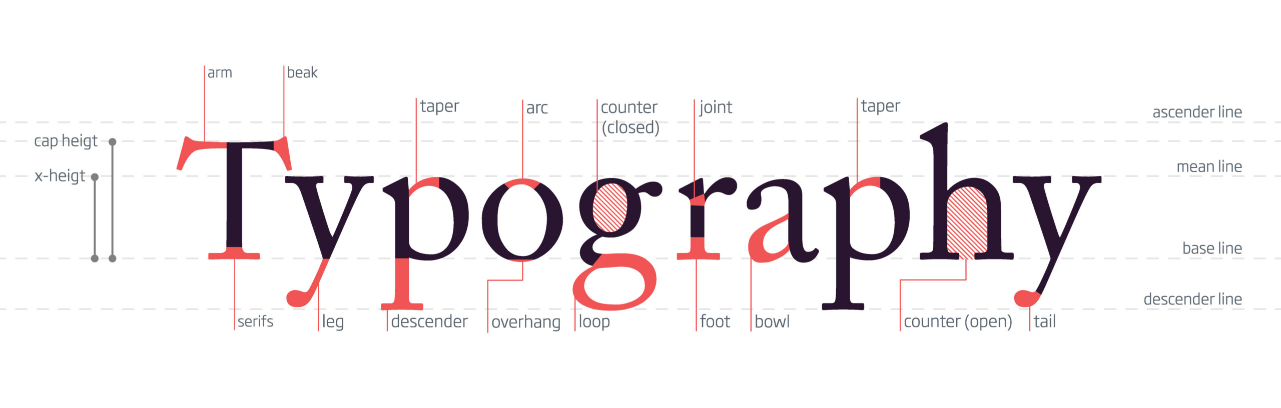
I started obsessing over fonts, treatments, layouts — pushing every project just a little further than it probably needed to go. While other people were finishing assignments, I was still nudging things by 0.5 points like it was going to change the course of history. (Sometimes it did. I stand by that.)
Then came the assignment: create your own typeface.
Most people played it safe. Handwritten fonts, expressive styles, things that felt manageable. I, in a completely on-brand move, chose chaos and decided to design a serif typeface.
This was strongly discouraged.
Serifs are not for beginners. They require consistency, proportion, restraint — basically all the things you don’t have when you’re learning. But I was determined. And somehow…it worked.
My typeface, vawk, was born.
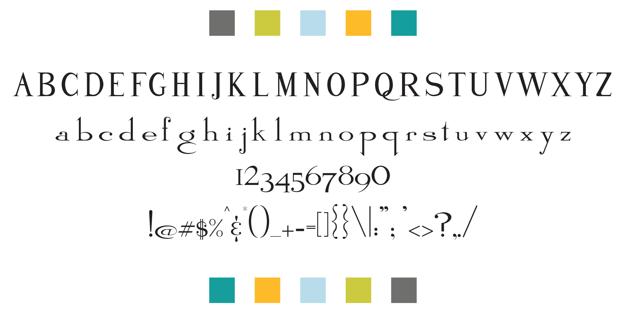
At the time, I thought it was brilliant. Revolutionary. A gift to typography itself. I used it in as many projects as humanly possible, like a proud parent forcing everyone to look at baby photos.
Looking back now? It’s…not great. Honestly, it’s kind of terrible.
But the process of creating it? That was everything.
Designing a typeface forced me to slow down in a way I never had before. Every curve had to relate to another curve. Every serif needed a reason to exist. Every letter had to feel like it belonged to the same family, even though they were all completely different shapes. It was part design, part engineering, part obsession.
It scratched both sides of my brain in the most satisfying way possible.
But what really sealed the deal wasn’t just creating type — it was what you could do with it.
One of our projects was to design a book using only a single typeface. Most people chose something flexible, something forgiving.
I chose Trajan.
If you’re not familiar, Trajan is…divisive. It’s dramatic. It’s all caps. It has (at the time) basically one weight. It’s the typographic equivalent of someone speaking only in movie trailer voice.
Naturally, I made things even harder for myself by deciding to use no imagery. Just type.
So now I was working with one font, one weight, all caps, no images. Truly thriving under self-imposed limitations.
The concept: each spread would be a typographic illustration of a movie that had used Trajan on its poster.
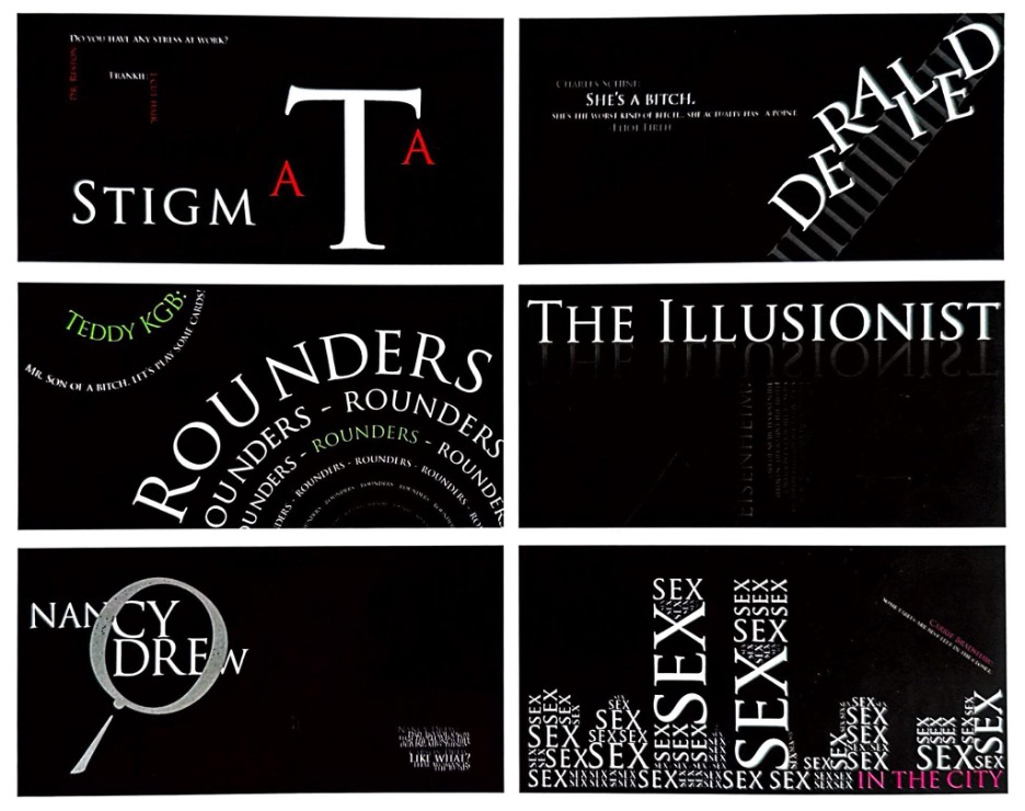
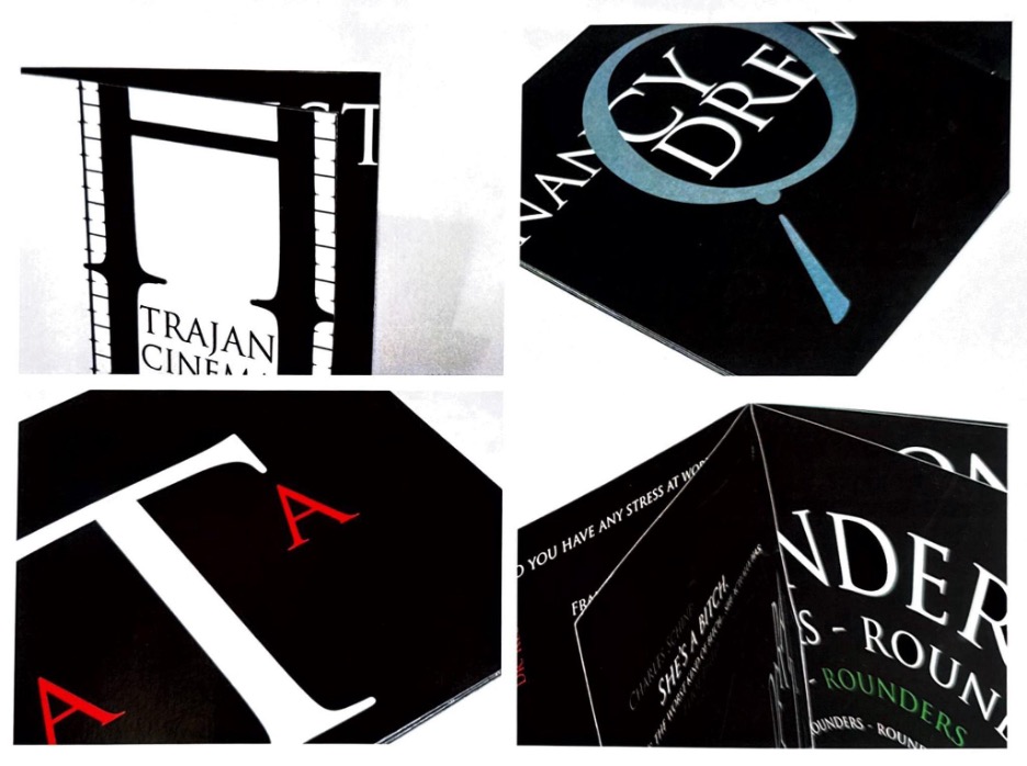
And that’s when typography really revealed itself to me — not just as a tool, but as a language.
And here’s the thing that really surprised me: typography isn’t just an artistic choice — it’s a business decision.
At the time, I thought I was just making things “look good.” But typography is doing a lot more heavy lifting than it gets credit for. It’s shaping how people feel about what they’re looking at before they’ve even read a single word.
Think about it — swap a clean, modern sans serif for something overly decorative, and suddenly a brand goes from “trustworthy and professional” to “maybe makes candles in a basement.” Same message. Completely different vibe.
Companies obsess over this stuff for a reason. The typography you choose can signal luxury, affordability, playfulness, authority, or chaos in a split second. It’s branding at a subconscious level.
That’s why brands invest millions into custom typefaces. It’s not just about being unique — it’s about being recognizable. Consistent typography builds familiarity, and familiarity builds trust. And trust, conveniently, is great for business.
Even outside of branding, typography is quietly running the show. Good typography guides you through information without you noticing. It tells you where to look, what matters, what to read first, and what you can safely ignore. Bad typography does the opposite — it confuses, frustrates, and occasionally makes you question your ability to read.
(We’ve all been personally victimized by a poorly designed menu.)
It turns out typography isn’t just decoration — it’s communication in its purest form. It’s the difference between something being understood and something being ignored.
And once I realized that, I stopped seeing type as just another design element.
It was the design.
Because when you strip everything else away — no photos, no color crutches, no decorative distractions — type has to do all the work. It has to create mood, movement, hierarchy, emotion. It has to act.
And somehow, it does.
Typography can whisper or shout. It can feel elegant, aggressive, nostalgic, futuristic, authoritative, or completely unhinged — all without changing the words themselves. Just the way they’re presented.
Same letters. Completely different experience.
That’s kind of incredible when you think about it.
It’s also kind of terrifying, because once you notice it, you can’t unsee it. Every sign, every menu, every badly kerned logo becomes a personal attack.
But mostly, it’s magic.
And that’s when I realized: I didn’t just like typography. I loved it.
And still do.
Share


About the author