Annual reports: The most underrated brand power move
-
Date Posted
2026-02-12
-
Tags
-
Written By

For some organizations, annual reports are a necessary evil — produced once a year, skimmed, filed away, and forgotten. A compliance checkbox. A very expensive PDF. The end.
But for organizations that know better, an annual report is a golden opportunity hiding in plain sight.
Even if you’re not legally required to produce one, an annual report lets you pause, look back, and say: Here’s what we did, why it mattered, and where we’re headed. That’s not admin — that’s storytelling.
Transparency = trust (and trust opens doors)
People don’t invest in, work with, or partner with organizations they don’t trust. An annual report gives you the chance to be open, honest, and confident about your progress — the wins, the lessons, and everything in between.
It shows stakeholders, clients, employees, and decision-makers that you’re not just busy… you’re purposeful. Whether it’s pulled out in a boardroom, sent to government stakeholders, or shared publicly, a well-designed report quietly says, We know who we are and where we’re going.
Not “just a report” — a full-blown brand asset
Let’s clear something up: an annual report isn’t a boring document unless you make it one.
When designed properly, it becomes one of your hardest-working marketing assets. It can act as:
- A credibility booster in new business pitches
- A polished piece for government and stakeholder engagement
- A recruitment tool that shows what it’s actually like to work with you
- A snapshot of your impact, values, and ambition
- An opportunity to showcase your visual brand to the highest level of design execution
Design is what turns all of that from good intentions into good impressions. The layout, typography, imagery, and tone do a lot of heavy lifting — often before anyone reads a single word.
Built for how people actually consume content
Gone are the days when “annual report” automatically meant a thick printed booklet gathering dust.
Print still has its place (and when done well, it’s a thing of beauty), but digital formats open the door to interactive reports, microsites, animations, video, and content that actually gets used more than once a year.
A smartly designed report can fuel your website, social content, presentations, and campaigns for months. One piece of work. Many, many uses. We love efficiency.
If you’re going to do it, do it properly
A forgettable annual report isn’t bad luck — it’s usually the result of cutting corners. A great one, on the other hand, is made from a few very deliberate ingredients.
A story people want to follow
Your report should read like a narrative, not a spreadsheet in disguise. What changed this year? What challenged you? What are you proud of? Where are you going next? When the story is clear, the numbers actually mean something.
Design that does the heavy lifting
No one wants to wrestle with walls of text or confusing charts. Clean layouts, clear hierarchy, and well-designed data visualizations make complex information easier to digest — and far less painful to read.
Good design doesn’t shout. It guides.
Branding that knows who it is
Fonts, colors, imagery, spacing, tone — they all send signals. When everything works together, your report feels confident and cohesive. When it doesn’t… people notice (even if they can’t quite explain why).
A human face
People connect with people, not pie charts. Leadership messages, staff spotlights, testimonials, and real stories bring warmth and credibility to your report — and remind readers there are humans behind the headlines.
Real images, not stock-photo smiles
Authentic photography builds trust. It supports your story, breaks up the content, and gives readers’ eyes a break. Plus, it avoids the dreaded “generic business people laughing at salad” vibe.
Design that respects the medium
Print should feel good in your hands. Digital should feel intuitive and engaging. Designing for the medium — not forcing one format to behave like another — makes all the difference.
Accessibility and sustainability (because it matters)
Eco-friendly materials, efficient layouts, and accessible design choices aren’t “nice extras.” They’re signals. They communicate values, awareness, and respect for your audience — often more loudly than a mission statement ever could.
Accessibility, in particular, is where many annual reports quietly fall down.
An annual report is meant to inform, reassure, and build trust. If parts of your audience can’t easily read it, navigate it, or understand it, that trust erodes — even if the content itself is strong.
Accessible design means thinking beyond aesthetics and considering how real people actually interact with your report. Clear typographic hierarchy, readable font sizes, sufficient color contrast, and logical structure make a report easier for everyone to use — not just people with identified access needs.
In digital reports, accessibility might include screen-reader-friendly PDFs, proper heading structures, meaningful link text, alt text for images, and layouts that work just as well on a phone as they do on a desktop. In print, it can be as simple (and powerful) as legible type, sensible line lengths, and avoiding design choices that prioritize “looking clever” over being readable.
And here’s the thing: accessible design doesn’t dilute creativity or brand expression. It sharpens it. It forces clarity. It encourages better hierarchy, stronger storytelling, and more intentional design decisions overall.
Sustainability works the same way. Thoughtful paper choices, efficient formats, and designing with reuse in mind show that you understand your impact — financially, environmentally, and socially. It tells readers you’ve considered not just what you’re saying, but how you’re saying it and who you’re saying it to.
You don’t need a dedicated page explaining all of this. When accessibility and sustainability are baked into the design from the start, they speak for themselves — quietly reinforcing that your organization is considerate, contemporary, and paying attention.
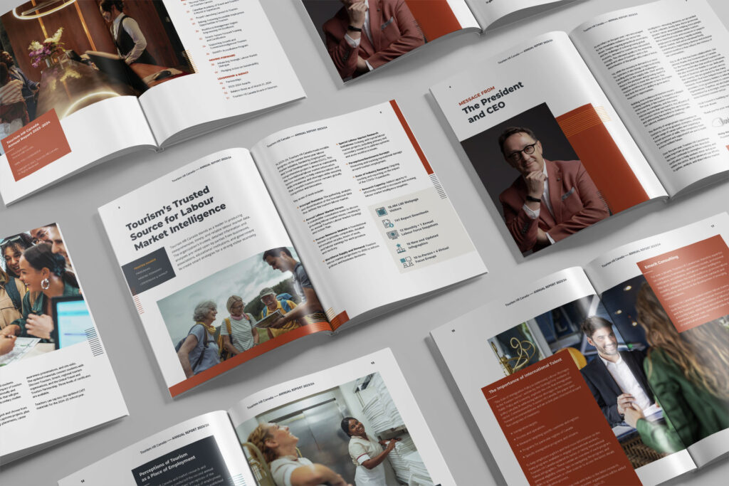
Accessibility, in action
We partnered with Tourism HR to create an annual report with accessibility at its core. Every detail — from clear hierarchy and readable typography to strong contrast and device-friendly layouts — was designed to make the report easy to use, understand, and navigate.
The goal wasn’t just to produce something visually appealing. It was to create a report that people would actually read, share, and reference long after launch day.
The result is a modern, purposeful annual report that works as a lasting brand asset, communicating Tourism HR’s impact, values, and direction with clarity and confidence.
View the report and explore it in detail → https://getinitiated.ca/work/turning-strategy-into-story-tourism-hr-canadas-annual-report/

The quiet power move
A great annual report doesn’t shout. It speaks clearly, with purpose, and with respect for the people reading it.
When treated as a brand asset — not a box to tick — an annual report becomes one of the most powerful tools an organization has. It builds trust. It tells your story. It shows exactly who you are and where you’re headed.
So if you’re going to invest the time to create one, make it work harder. Design it with intention. Build in accessibility. Think beyond launch day.
Because a well-crafted annual report doesn’t just reflect the year that was — it sets the tone for what comes next.
Share
About the author