Polymath: Bringing clarity to a growing brand
A company’s brand is its hallmark
It must be carefully managed to present a consistent, recognizable, and polished image in the market. Polymath had developed an appealing B2B visual identity, but its execution lacked consistency. Multiple logo variations and graphic elements, each with different patterns and treatments, allowed for too much flexibility—often resulting in an over-designed and nonstandard appearance.
Refining Polymath’s visual identity for consistency, polish, and long-term impact
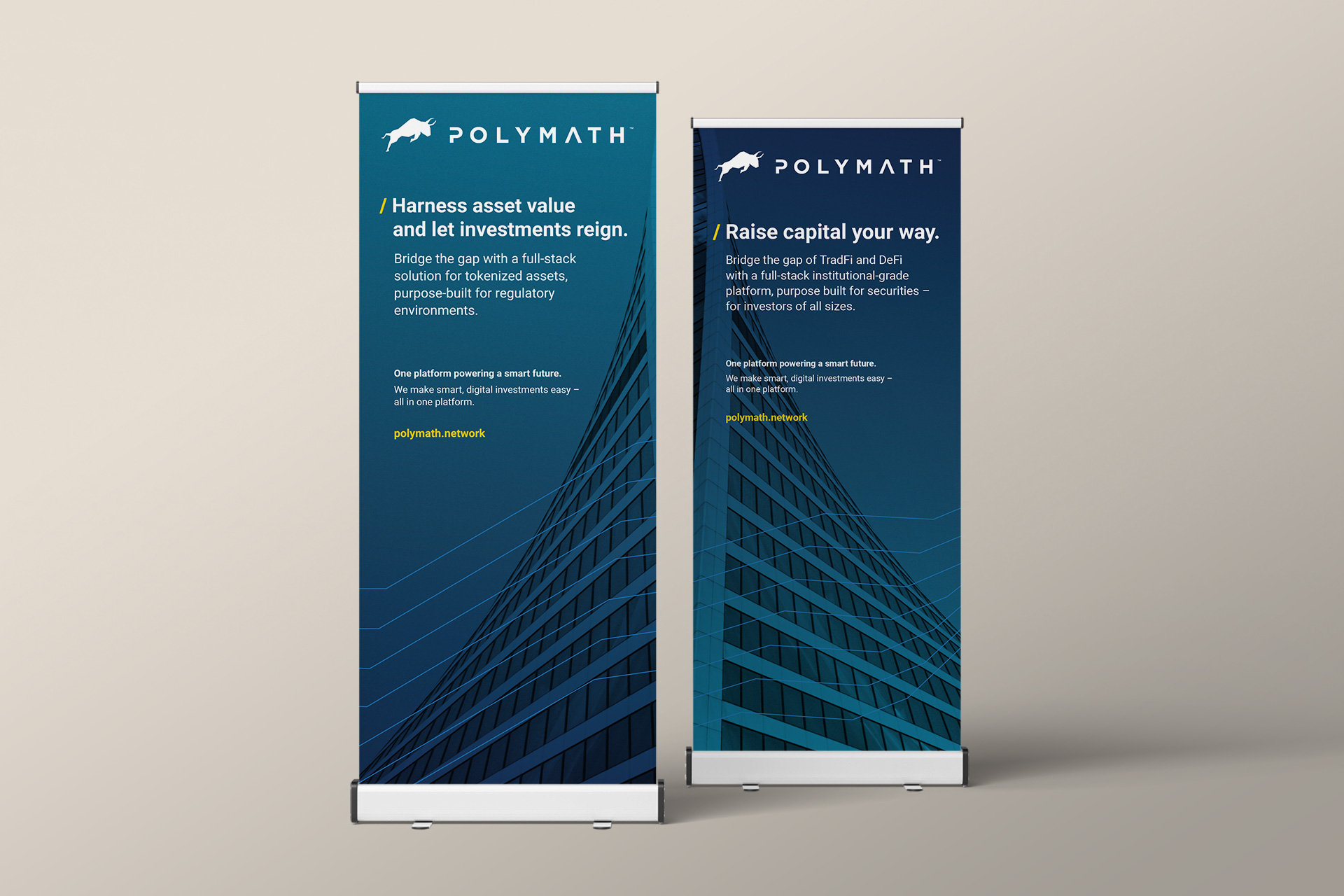
We started by conducting a comprehensive audit of Polymath’s website and brand visuals. We streamlined the available executions and graphic elements, then applied the refined system across stationery, collateral, and the website. The result is a fresh, clean design that feels open and modern while remaining appropriate for a tech company.
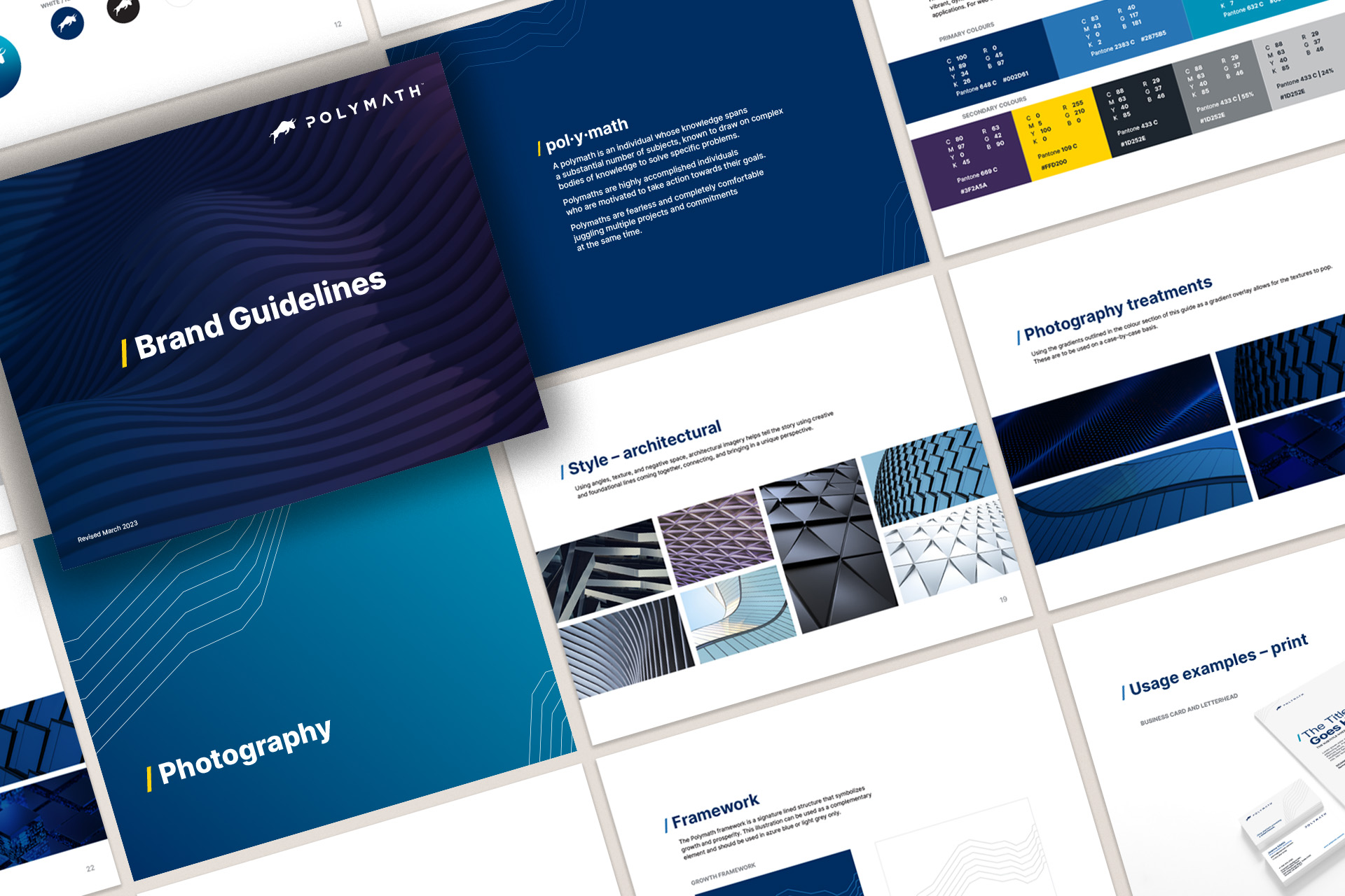
The brand guidelines we developed establish clear rules for the use of Polymath’s logo, colour palette, and typography. They unify the visual language across all patterns, styles, and design elements to ensure consistency in all future marketing materials.